
Best Logos for Start-ups & Rebrands
Best Logos for startups
Whether you have just registered your company, decided to go solo as a freelancer or are looking to build a business on the side, picking the right logo is essential for reaching the right clients and setting up your visual communications for long term success.
Branding for a new business can feel extremely daunting. From commissioning your first designer to understanding what logo you need It can feel like a lot to manage on top of all your other burning commitments.
Don’t worry this blog is split into two sections to quickly give you a foundation in picking out the best logo direction for you. First up we look at what a logo does and does not do for you and your brand. Then in part two, we are sharing a breakdown of different logo categories.
What a logo does and does not do for you.
Logos and personal brands are nothing new. The Japanese Mon, or emblem, predate the 12th century and were used to signify family lineage, through contemporary looking graphic symbols. Jumping forward to 1976, Bass Brewery secured the very first UK trademark for its iconic red triangle and custom brand lettering.
Today, the logo has become a central part of almost all businesses, serving as the first connecting point to your audience and customers.
At this point, we need to establish what a logo is not. A logo is not the brand. The brand is the accumulation of the product, service, experience and reputation that you build over time. Internally, the brand identity is the expression of the founder's vision for the company. A logo comes to represent all of this over time. A poorly aligned logo will be unlikely to gain the same level of trust as one that is curated in keeping with the brand values and the way it does business.
A logo in today’s digital multiplatform and traditional print touchpoints needs to do a lot of heavy lifting. In many cases, a visual identity that can adapt to more directly within each of these spaces can help you to be seen more intentionally by customers, supporting faster unrestricted growth and communication ( see blog, " What’s a visual identity").
However, for many new businesses, this is not an investment they are able or ready to make. Understanding who they will serve, how they will deliver their goods and where the opportunities lie only come after a little time working in the business.
The logo offers a clear path to recognition, especially in locally driven markets. For example, a brand selling small batch rum online needs to reach a niche target audience and therefore needs to reach them online, at events, in person through speciality retailers and through its branded packaging. In this case, a visual identity that can communicate flexibly and be recognised easily across these spaces will deliver more sales and connection opportunities with their audience.
However. If a business works in a specific location, like a coffee truck, for example. Then a fixed logo might offer a faster path to customer recognition and trust as it will become more familiar to them, more quickly than a complex visual system that adopts ten different brand illustrations and colours, as opposed to a fixed logo.
The big takeaway here is to stop thinking about needing a logo and to start thinking about your visual communication needs. Whether you start with a logo system or a larger visual identity, you are crafting your brand's message through your visual communications, not your logo alone.
Types of logos and their use cases.
The monogram
What is it: Typically, a company’s or person's initials, presented in an interlocking or overlapping way.
Examples: V&A, Yves Saint Laurent or Chanel.
Tone of voice: Seen in high end fashion and brands communicating luxury or elegance. It is good for brands with a connection to heritage and can work strongly as a highly decorative or contemporary mark, without losing the essence of the past. Ideal for brands looking to stand out for refinement or to elevate the personal within a personal brand to communicate trust.
Considerations: Some monograms can be very elaborate and decorative. These make for beautiful additions to company brochures or on the front of menus with foil inlays. However, they may not always work for smaller online applications, as they can struggle to scale down when overly decorative. It is possible, therefore, that you might need a second version of the logo that can be applied to make sure your brand looks sharp at all sizes without it becoming illegible. Applied incorrectly to a brand, the style of monogram may also date the company or shift the tone of voice in a way that feels inauthentic.
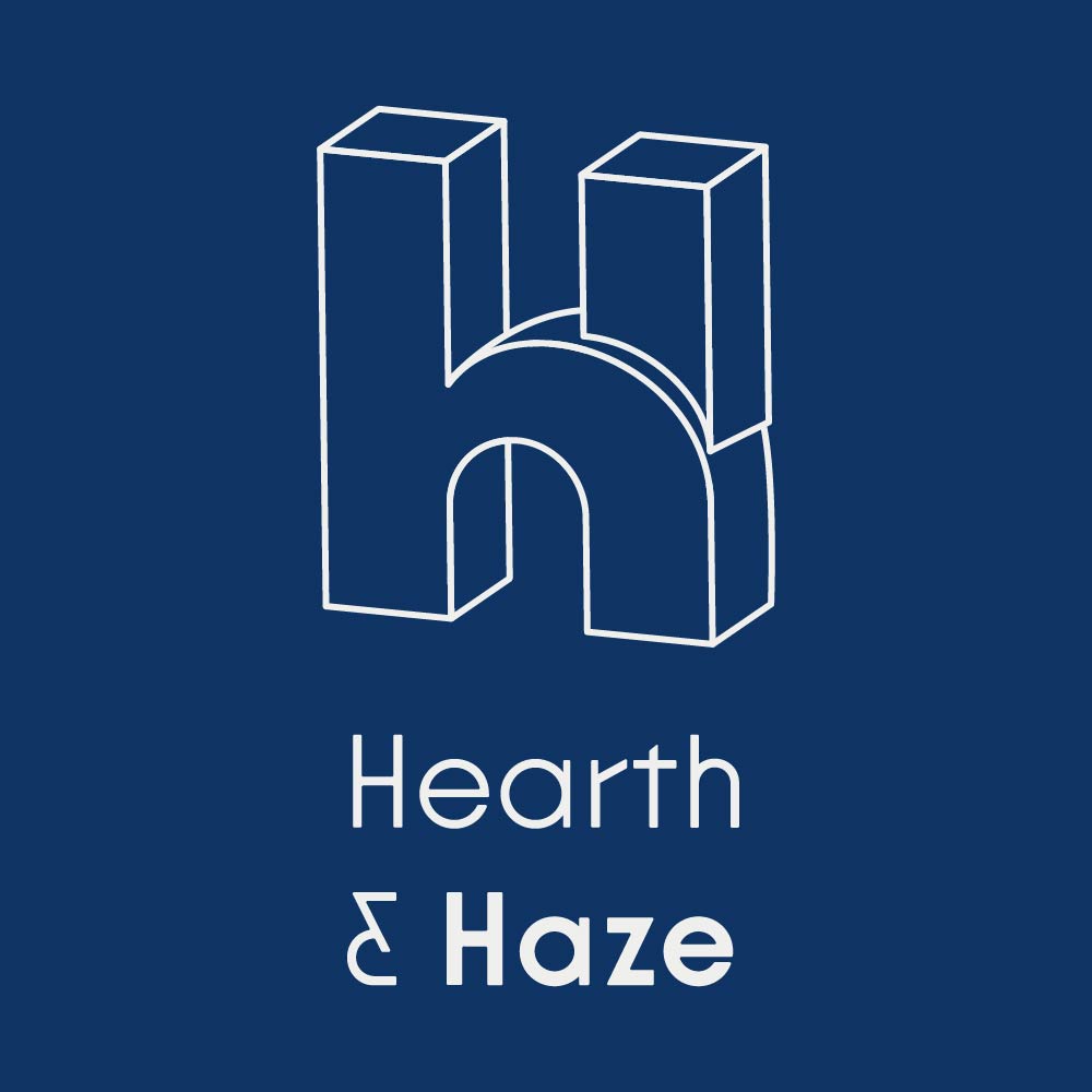
Letterforms & Wordmarks
What is it: The letterform uses a company’s first initial/s or an abbreviation to conceptually or stylistically represent the brand. A wordmark, or logotype, uses the brand's whole name as the primary mark. Often starting as a font, they are then customised and stylised, or may feature custom lettering, or new custom font designs that then belong to the brand as a valuable part of their visual IP.
Examples: Facebook, Pinterest, Beats, NASA, Coca-Cola and Sony.
Tone of Voice: Modern, clean and often seen in B2B settings where the balance of modernity and trust is required. Functionality will likely be an important factor, as brands will often need to function across diverse touchpoints cleanly. While these logos may at times appear more commercial, plenty of creative and dynamic brands follow this path, such as Rapha and Lucy & Yak, showing you can also bring a sense of playfulness and refined craft without feeling overtly corporate.
Considerations: This is a common path for many projects, but it has fallen into a category sometimes referred to as Blanding. This is the process of using a clean sans serif font and simply writing the company name in black, while stripping out the elements of personality. Many heritage brands have tried and backed away from this approach as it didn’t align with their history and left customers cold. Some argue this is a practical aesthetic for digital applications and a further step towards minimalism and utility. Brands, however, have stories and personalities, so don’t be afraid to lean into this in your own logo and brand; it’s all about being bold, context and the level of appropriateness.
Symbols, Pictorial & Abstract Marks
What is it: Symbols are the decorative marks many think of when they are picturing a logo. Pictorial marks like those used by Apple or Shell are direct representations of the company name; however, metaphorical ideas to express a brand's values, function or services can often be more effective, such as the famous blue bird of the original Twitter logo, for example. Abstract marks remove the company function entirely, often hinting towards ideas like connectivity or movement, for example.
Examples: Apple, Shell, Twitter, Chase Bank & Slack.
Tone of voice: Clean and often unique way to communicate your brand to your customers. Paired with a custom colour palette and enhanced by the right typographic treatment, you have a strong basis for a new brand identity. These marks will typically work well at a range of sizes and applications. They also adapt cleanly between colour and black and white, offering a brand a simple way to brand merchandise and print materials. All good logos should do this, but not all achieve it as well.
Considerations: A stylised symbol does not have to be a literal representation of what your company does. This approach may be appropriate, but it risks feeling more corporate or misses an opportunity to show your company in a more creative light. Customers are clever, so be careful not to brand yourself as a rigid thinking company.
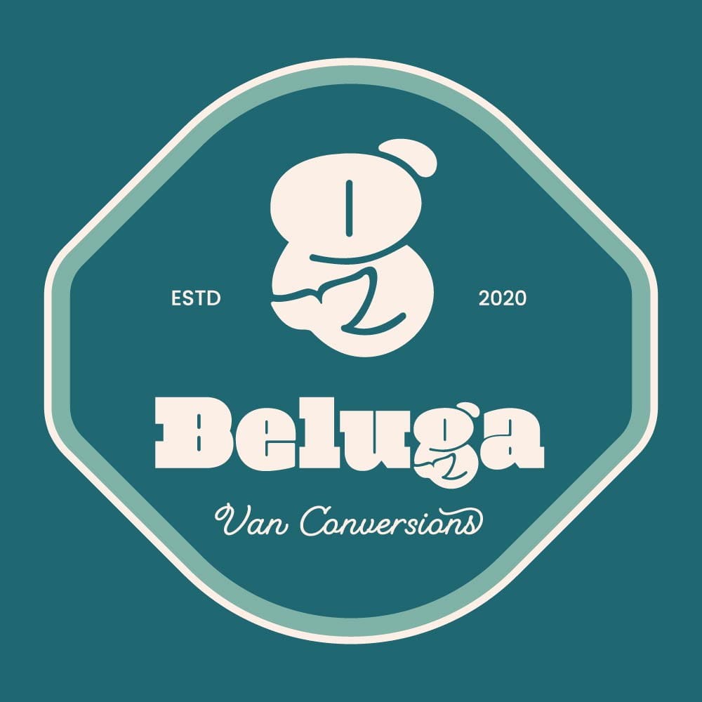
Emblems & Mascots
What is it: The Emblem brings together a range of previously discussed types of marks, but in a different way. Made up of a container, they feature a combination of letters, wordmarks, and illustrative and decorative elements. These logos have their history in family crests and shields. The mascot can be presented illustratively or graphically and is a more playful character led approach to a company brand.
Examples: Warner Brothers, Ferrari, The KFC Colonel, Duolingo bird, Michelin Man and Ronald McDonald.
Tone of voice: Emblems can bring a sense of refined complexity and unity to a brand. They are good for heritage brands as they allow links to the deeper roots of the brand, often through illustration. The container also becomes a unique signifier of the brand. Mascots, conversely, often communicate a sense of playfulness, providing a communication vehicle that is highly flexible. Tone of voice ranges for mascots, but in general, it signals that we are a company that does not take things too seriously. This is useful in leisure activities, or direct to consumer sales, which is why they are commonplace in food, drink and retail settings.
Considerations: Emblems can might feel dated yet remain iconic for established brands. The application of them needs to reflect the brand needs carefully, which is why they work well as a secondary design asset, such as Beluga Van Conversions. In that project, the container represents a camping patch and a way to communicate through stickers and merchandise that the company is about the outdoors and adventure. However, like many emblems, it would be overly detailed to work across digital platforms strongly and does not hold the same visual punch as the primary symbol in isolation. Conversely, mascots in the 1950s rubber hose style have been hugely popular in the streetwear, speciality coffee and food sectors in recent years. This trend is coming to an end now, but the more graphic minimalist style mascot still holds a timeless quality when executed well and avoiding Ai tropes that reproduce dated trend driven outputs.
The Sub Mark & Brand Assets
What is it: A secondary mark that supports the main logo by allowing for my flexible application of the company’s brand, enhancing consistency.
Considerations: A secondary mark is often a necessity to ensure your brand can adapt in different spaces and still communicate clearly. For example, Fulcra Creative uses a wordmark featuring custom lettering. However, this does not scale down well, but looks bold at scale. Therefore, we use a combination of a contemporary monogram, which combines the FC for smaller applications and in very small applications, we apply the primary logos F in isolation. However, this mark is specifically adapted to make the internal spaces larger, meaning they are more readable when small. These both feel aligned to the brands hand made feel but adapt flexibly.
Brand assets are not logos, but branded extensions of the brand itself. These might be branded icons, graphics or illustrations. You will typically see more of these elements coming into play within larger visual identities, where flexible applications are needed. These can be excellent signifiers of your brand and tone of voice. They are not, however, a logo or suitable as a logo in isolation.
There we have it, everything you need to know about different types of logo. Obviously, this isn’t all that can be said, or the many nuances with each type of logo. However, I hope it gives you a good foundation to reflect on your own needs and how you can adopt the right approach to help you enhance your visual communications with your customers.
If you would like to discuss your project or the right fit for your brand, why not get in touch for a discovery call, and we would be delighted to hear about what you’re building and how to help you tell your story.